I was tasked with creating an image for the band 5 or 7's Christmas message. The message was online only for sharing on Social Media.
I was given a selection of photos, but chose one that had strong lines and was a good photo of the guys. The logo was a white on black image - so I isolated the black and deleted it, and then changed the white outline using a 'stroke' effect so that it fit more in line with the colour themes of the image.
Interestingly my bevelling and embossing and other layer effects didn't save out when I tried saving as a JPEG or PNG. I'm not sure why that was - it needs a bit of further investigation.
With a short time frame and knowing that it's going to be a short-lived online-only image I just went the easy route and screenshot my photoshop image!!
Now I'm looking at it I'm wondering if I should've sepia'ed the image and moved the guys down further so you saw more of the church.
I guess there's always more tweaks I could do - so hard to say 'enough' and move on!!
Friday, 21 December 2018
Thursday, 29 November 2018
Bauhaus - my assignment journey
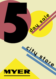
So the latest assignment for my course was to create an ad for Myer's 5 day sale at their City Store. I had already based my research for this section of my course around the Bauhaus movement (1919 - 1933 in Germany). Partly because I've been to the Bauhaus Archive in Berlin, and partly because I like their central theme that form follows function.
FUNCTION
---------------
FORM
I find that this central theme is really applicable to today's web design and development. In essence, I equate it to Usability. So while I'm not a fan of the period's architecture, or other outputs, I am a fan of the idea behind it.
So, back to my assignment. I researched posters of the time, and with those in mind I created my first iteration:
I was lucky enough to have a designer-friend who is interested in Bauhaus to review my design. He reviewed my design and came up with a couple of really interesting comments.
So after those comments I had another pass and came up with:
I'm still using the P22 Bayer Universal font. But the grid is a strong 45degrees, the background is white, the colours are strong.
I like that I've got a bit of Mondrian going on (I love his work) and I feel that this design is a lot clearer than my first iteration.
To be honest, I really could've spent so much more time on it. But I guess another thing I'm learning is that I have to say 'enough' to myself and submit. Otherwise I'd probably still be tinkering with it!
FUNCTION
---------------
FORM
I find that this central theme is really applicable to today's web design and development. In essence, I equate it to Usability. So while I'm not a fan of the period's architecture, or other outputs, I am a fan of the idea behind it.
So, back to my assignment. I researched posters of the time, and with those in mind I created my first iteration:
Colour
First of all, I'd used a cream background and muted colours. He questioned why and then realised I'd been looking at the posters from the time for my inspiration. He pointed out that the posters are old and the colours have faded, the paper aged. I felt a bit silly at that point - it was a 'doh!' moment. He suggested 'punchier primaries'.Grid
So I knew that Bauhaus introduced the grid, and I also knew they were into their angles, but somehow I didn't marry those two things together. He pointed out that the lines should be at right angles to eachother - that although it was angled, the grid is still important. Another 'doh!' moment. Of course, the grid should be rotated by 45degs to cope. Of course.So after those comments I had another pass and came up with:
I'm still using the P22 Bayer Universal font. But the grid is a strong 45degrees, the background is white, the colours are strong.
I like that I've got a bit of Mondrian going on (I love his work) and I feel that this design is a lot clearer than my first iteration.
To be honest, I really could've spent so much more time on it. But I guess another thing I'm learning is that I have to say 'enough' to myself and submit. Otherwise I'd probably still be tinkering with it!
Thursday, 15 November 2018
The Bauhaus Movement - collated research
I'm currently writing an essay for my course on the Bauhaus movement. I did a ton of research and thought I'd share my collection of links:
Background
information
Wikipedia’s article on Bauhaus was a great starting
point:
The Art Story was a great source of
background information, plus links to other articles:
The Bauhaus Museum website provided information about
what was taught at the Bauhaus school:
The Tate has some general information about
Bauhaus:
Videos
Zillion Designs produced a great video on the
essentials of Bauhaus:
The ABCs of the Bauhaus was a good introduction
using the shapes and images of the movement:
Bauhaus: the Face of the 20th
Century is a longer video about Bauhaus:
Graphic
Design
The GreenGinger article ‘Why is Bauhaus still so
influential today’ provided background information on the movement and how it
influenced Graphic Design today:
DesignLab outlined lessons for today’s
designers about Bauhaus and why the web is still Bauhaus:
Fonts
Digital Arts was an introduction to Adobe’s free
Bauhaus fonts:
Looking further into Bayer and his fonts led
me to the New York Times article:
Influential artists
99Designs was good for information about the
influential artists in the Bauhaus movement:
AIGA was good for examples of Bauhaus design:
Art work
My Modern Met showed how the avant-garde
movement transformed modern art along with the history of the Bauhaus movement:
Smashing Magazine is a great collection of
Bauhaus artwork:
I really like Piet Mondrian’s work, and
looked into his influence on the Bauhaus movement. The Art Story was a good resource for
information that ultimately led me to conclude he wasn’t a key figure in the
Bauhaus:
Wednesday, 31 October 2018
Is skeuomorphism back?
I've just been looking at the various incarnations of the QANTAS logo. From 1944 to 2016 it's had rather a few changes. A great site to see the journey is: http://logos.wikia.com/wiki/Qantas.
In 2007 the logo changed to be the flat version that a lot of companies changed to around that time. The explanation (as I understood it) was that companies were conscious of download speeds, responsive environments, making sure their logos scaled well.

In 2016 however, the logo changed again. Back in is shading, gorgeous curves - the text has been sharpened and made easier to read - the tail fin now looks like an aircraft tail fin. It looks .. modern!

So when did logos start getting shading again?
In 2007 the logo changed to be the flat version that a lot of companies changed to around that time. The explanation (as I understood it) was that companies were conscious of download speeds, responsive environments, making sure their logos scaled well.

In 2016 however, the logo changed again. Back in is shading, gorgeous curves - the text has been sharpened and made easier to read - the tail fin now looks like an aircraft tail fin. It looks .. modern!
So when did logos start getting shading again?
Tuesday, 18 September 2018
Photomedia - Gordon's Dad - FINAL
So, I've pulled together all of the elements in Photoshop and produced the final image. I used Gordon's model village as the background and arranged the buildings into a bit of a courtyard. This image was then enhanced in Photoshop with a photograph I took of the sky as the backdrop. Finally I put in the cleaned and sharpened photo of Gordon's Dad.
I gave him a shadow to make it a bit more realistic and resized the image to fit the output - which was a 30cm x 30cm canvas print I ordered from VistaPrint.
Any feedback on the final image is welcome!
I gave him a shadow to make it a bit more realistic and resized the image to fit the output - which was a 30cm x 30cm canvas print I ordered from VistaPrint.
Any feedback on the final image is welcome!
Saturday, 15 September 2018
Photomedia - Gordon's Dad - Part 3
So, I've picked out the model buildings for the background - now it's time to try and get the original fuzzy image into something a bit more usable. I used the Filter -> Other -> High Pass filter with the 'Hard Light' layer type. That seemed to produce the sharpest image. I also played with the levels and managed to go from:


to:

Which I'm not too unhappy about. It's not perfect, but I think it's okay for this purpose. So the last thing to do is sort out the composition and pull all the elements together.
Photomedia - Gordon's Dad - Part 2
So I've been trying to figure out what background the main character (Gordon's Dad - Alan) should go onto. First of all I thought a photo from Morpeth where he lives would be cool.


But it didn't really work. Because the main figure is holding a drink, he really needed to be in front of an appropriate background, like a pub. Gordon makes models, so I thought it would be cute to use one of his current diorama which is Victorian London.

Again, this didn't work either, he's wearing the wrong period to fit neatly into this environment. So we dragged out an old set of models that fit the time period of the costume much better:


This was much better - and definitely the backdrop I'll progress with.
Wednesday, 12 September 2018
Photomedia - Gordon's Dad - Part 1
I have a photo of Gordon's Dad dressed up in 18th Century Costume. I've decided that it would be a good subject for a Photomedia project (as part of my design course) - to take the photo and put it into an 18th Centure setting. It will also make a great birthday pressie - and I'm all about killing two birds with one stone!
So the first thing I'll do is come up with a rough idea of what I want to achieve. I have some initial thoughts, but I want to have a detailed examination of the imagery I already have and figure out what imagery I'll need to either photograph myself or source (complying with all copyright of course).
This will help inform what the final image will look like.
I'm going to start with this image - the central image of the piece:

I've put together a moodboard of some images that might be appropriate. In my research I've found images from a street scene created by Gordon in 28mm models.

I'm still debating about whether to have him in an alley, or out the front of a pub, which seems like it would be a more natural environment for someone cheersing with a glass of wine!
So the first thing I'll do is come up with a rough idea of what I want to achieve. I have some initial thoughts, but I want to have a detailed examination of the imagery I already have and figure out what imagery I'll need to either photograph myself or source (complying with all copyright of course).
This will help inform what the final image will look like.
I'm going to start with this image - the central image of the piece:

I've put together a moodboard of some images that might be appropriate. In my research I've found images from a street scene created by Gordon in 28mm models.

I'm still debating about whether to have him in an alley, or out the front of a pub, which seems like it would be a more natural environment for someone cheersing with a glass of wine!
Photomedia - Steampunk FINAL
It's done! I went with the photograph of myself holding onto my hat and the title of 'It's Raining Steampunk'.
I actually had a lot of fun painting a browny backdrop for the piece.

I then took all the steampunk elements I photographed and separated them out to form the 'rain drops' and pulled the whole image together.

I like the colours, but I think photographing the elements (the cogs particularly) in a lightbox would've made the final composition a lot easier. Although Photoshop has gotten really amazing at picking out a subject from the background and letting you refine that selection, there was still some bleed from the background.
I also think that I'd probably introduce more elements to give it a more chaotic feel.
Having said that, I'm pretty happy. It communicates the fun I wanted to project.
Now I need to make a lightbox for my next project!
I actually had a lot of fun painting a browny backdrop for the piece.

I then took all the steampunk elements I photographed and separated them out to form the 'rain drops' and pulled the whole image together.

I like the colours, but I think photographing the elements (the cogs particularly) in a lightbox would've made the final composition a lot easier. Although Photoshop has gotten really amazing at picking out a subject from the background and letting you refine that selection, there was still some bleed from the background.
I also think that I'd probably introduce more elements to give it a more chaotic feel.
Having said that, I'm pretty happy. It communicates the fun I wanted to project.
Now I need to make a lightbox for my next project!
Photomedia - Steampunk part 3
So from my first thoughts of creating an image around the theme of Steampunk, I've moved onto the title 'It's Raining Steampunk' and taken the central photo. I featured that photo in my last blog.
The next step was to photograph and isolate my Steampunk elements:
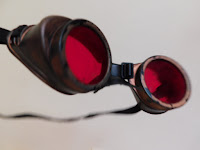
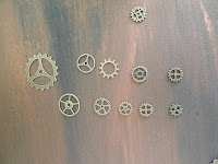
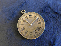
These will form the 'falling down' or 'rain like' element to my image.
From there it's just a question of pulling together the final piece.
The next step was to photograph and isolate my Steampunk elements:


These will form the 'falling down' or 'rain like' element to my image.
From there it's just a question of pulling together the final piece.
Photomedia - Steampunk part 2
Progressing along with my Steampunk photomedia project, I've been taking photos that I think might be useful. I was going to go with a 'dream-like' feel, but trying to capture smoke and encorporate that looks like it may be a bit hard at this stage.
So I've moved on with the idea of Steampunk and I'm thinking of using an image based on the photo of the girl in my last blog post, but of me in a more structured environment. That way I have more control over the contrast and lighting.
I had a day of photography and have come up with some elements I really like. I've taken a picture of myself to be the central part of the image:
After taking the photo I got to thinking about the song 'it's raining men' - what if I subverted that to be 'it's raining steampunk'? I could then introduce all of the elements I was thinking of initially - the cogs, fob watches and goggles - raining down onto my head.
More photography required!
Photomedia - Steampunk - part 1
For my design course I need to pull together a photomedia project based on a theme.
Having recently attended a Steampunk festival, I think it would be great to do something around this theme. I'm thinking about fob watches, goggles, top hats, cogs. Perhaps something around a Steampunk dream - something ethereal?
At the festival there was a giant steampunk bug - it was used as the DJ system for the evening event. We all dressed up and took silly photographs. I really like the fun in this photograph - holding onto a top hat with goggles attached:
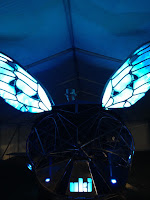

I'm going to see about bringing these elements into my Steampunk themed project.
Having recently attended a Steampunk festival, I think it would be great to do something around this theme. I'm thinking about fob watches, goggles, top hats, cogs. Perhaps something around a Steampunk dream - something ethereal?
At the festival there was a giant steampunk bug - it was used as the DJ system for the evening event. We all dressed up and took silly photographs. I really like the fun in this photograph - holding onto a top hat with goggles attached:


I'm going to see about bringing these elements into my Steampunk themed project.
Tuesday, 11 September 2018
Putting together a design brief
The Web Designer Depot have put together a great article on how to create a good design brief.
As a designer, you need to capture what the company does - their niche market and USPs. Importantly, you need to capture what they want out of the piece of design work.
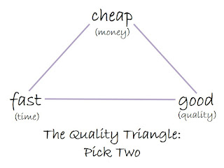
Budget and time constraints - obviously. This reminds me of the web triangle - Good Fast Cheap - pick two.
(Thanks to Katherine Writes for the image)
Getting all of this information out of the client (including their likes, dislikes, colour preferences etc etc) can take the form of a questionnaire, an interview, or providing the client with a guide on how to write a brief (if they've not done it before).
Thursday, 23 August 2018
Photomedia: Alexia Sinclair
This is my 2/2 blog posts about Photomedia artists. In this one I've chosen to look at Alexia Sinclair who produces vivid, gorgeous pieces with a fantasy feel.
In her collection ‘The Regal Twelve’ she combines photographic elements and illustrations to portray 12 female European monarchs.
Sinclair starts with a photo of a posed monarch. The image below shows Elizabeth the 1st in a heavily stylised version of her famous collared gown. The accoutrements of power are clasped in her hands. Her hair is an extraordinary feature that works as a crown. Framing her hair in the background there’s a halo which gives her a holy look. She’s sat on a chess board as a pawn, other pieces surrounding her.
https://alexiasinclair.com/collections/the-regal-twelve
The awesome things about Sinclair is her willingness to share her process - and it's amazing how much work she puts into a single photograph. This is evidenced by her video showing the process for Into the Gloaming:
The awesome things about Sinclair is her willingness to share her process - and it's amazing how much work she puts into a single photograph. This is evidenced by her video showing the process for Into the Gloaming:
https://www.youtube.
More of Sinclair's work is viewable on her website:
https://alexiasinclair.com/
https://alexiasinclair.com/
Photomedia: Michael Cook
As part of my design course I was tasked at looking at two Photomedia artists and deconstructing how they produced their images. For my first artist, I'm looking at Michael Cook.
Cook is a Brisbane based artist. One of his series is called Invasion and is about alien creatures invading London. The images are a flip of Australian Colonial History - in these images the aggressors are iconic Australian creatures, and the victims in these images are white Londoners. As Australia was invaded, Australia is invading back!
Cook starts with a base picture of an iconic London streetscape. The ‘invaders’ are cut into the scene. The image below looks like bald cockatoos (a nod to Australian wildlife) menacing people running screaming to avoid them. There are people emerging from the tube station exit encountering the fierce birds. The image is washed out - almost like it was an old photo - taken at a time where the colouring of photos wasn’t at the level it is today. The people in the scene are dressed in outfits from the 40s, 50s and 60s. Perhaps a nod to the period of white immigration into Australia.
The other images from the series feature different Australian animals, menacing the people of London, and all feature people in older-style clothing in a similarly washed out looking photo.
Australia is invading!
Cook’s photos are available on his website:
They were exhibited at the ‘This Is No Fantasy’ gallery:
Thursday, 16 August 2018
Photomedia with a surreal twist
I've been exploring Photomedia recently and have come across some stunning examples of image manipulation and composition.
Someone that really stands out is Erik Johansson - he creates surreal images that play with your perceptions and launch you into a fantasy world.
Uli Staiger talks about his workflow in a promotional video for Adobe Photoshop, showing the way he pulls together images to create something new and interesting.
As part of my design course I'll be delving into creating my own Photomedia in the very near future. The artists above provide good inspiration and indeed aspirations.
Subscribe to:
Posts (Atom)

