FUNCTION
---------------
FORM
I find that this central theme is really applicable to today's web design and development. In essence, I equate it to Usability. So while I'm not a fan of the period's architecture, or other outputs, I am a fan of the idea behind it.
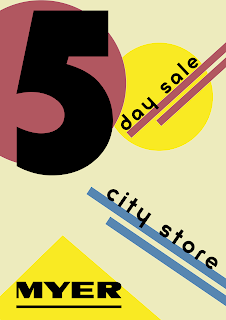
So, back to my assignment. I researched posters of the time, and with those in mind I created my first iteration:
Colour
First of all, I'd used a cream background and muted colours. He questioned why and then realised I'd been looking at the posters from the time for my inspiration. He pointed out that the posters are old and the colours have faded, the paper aged. I felt a bit silly at that point - it was a 'doh!' moment. He suggested 'punchier primaries'.Grid
So I knew that Bauhaus introduced the grid, and I also knew they were into their angles, but somehow I didn't marry those two things together. He pointed out that the lines should be at right angles to eachother - that although it was angled, the grid is still important. Another 'doh!' moment. Of course, the grid should be rotated by 45degs to cope. Of course.So after those comments I had another pass and came up with:
I'm still using the P22 Bayer Universal font. But the grid is a strong 45degrees, the background is white, the colours are strong.
I like that I've got a bit of Mondrian going on (I love his work) and I feel that this design is a lot clearer than my first iteration.
To be honest, I really could've spent so much more time on it. But I guess another thing I'm learning is that I have to say 'enough' to myself and submit. Otherwise I'd probably still be tinkering with it!


No comments:
Post a Comment