Wednesday, 31 October 2018

Is skeuomorphism back?

I've just been looking at the various incarnations of the QANTAS logo.  From 1944 to 2016 it's had rather a few changes.  A great site to see the journey is: http://logos.wikia.com/wiki/Qantas.

In 2007 the logo changed to be the flat version that a lot of companies changed to around that time.  The explanation (as I understood it) was that companies were conscious of download speeds, responsive environments, making sure their logos scaled well.

 Qantas logo 2007


In 2016 however, the logo changed again.  Back in is shading, gorgeous curves - the text has been sharpened and made easier to read - the tail fin now looks like an aircraft tail fin.  It looks .. modern! 

Qantas Logo 2016

So when did logos start getting shading again?

Tuesday, 18 September 2018

Photomedia - Gordon's Dad - FINAL

So, I've pulled together all of the elements in Photoshop and produced the final image.  I used Gordon's model village as the background and arranged the buildings into a bit of a courtyard.  This image was then enhanced in Photoshop with a photograph I took of the sky as the backdrop.  Finally I put in the cleaned and sharpened photo of Gordon's Dad.

A gentleman in 18th Century Costume with a model village in the background


I gave him a shadow to make it a bit more realistic and resized the image to fit the output - which was a 30cm x 30cm canvas print I ordered from VistaPrint.

Any feedback on the final image is welcome!

Saturday, 15 September 2018

Photomedia - Gordon's Dad - Part 3

So, I've picked out the model buildings for the background - now it's time to try and get the original fuzzy image into something a bit more usable.  I used the Filter -> Other -> High Pass filter with the 'Hard Light' layer type.  That seemed to produce the sharpest image.  I also played with the levels and managed to go from:

A fuzzy image of Gordon's dad
to:
A sharper version of Gordon's dad
Which I'm not too unhappy about.  It's not perfect, but I think it's okay for this purpose.  So the last thing to do is sort out the composition and pull all the elements together.


Photomedia - Gordon's Dad - Part 2

So I've been trying to figure out what background the main character (Gordon's Dad - Alan) should go onto.  First of all I thought a photo from Morpeth where he lives would be cool.

An alleyway
A courtyard
But it didn't really work.  Because the main figure is holding a drink, he really needed to be in front of an appropriate background, like a pub.  Gordon makes models, so I thought it would be cute to use one of his current diorama which is Victorian London.


A model pub with little model figures
Again, this didn't work either, he's wearing the wrong period to fit neatly into this environment.  So we dragged out an old set of models that fit the time period of the costume much better:

A model village with a pub, a house and a church
This was much better - and definitely the backdrop I'll progress with.

Wednesday, 12 September 2018

Photomedia - Gordon's Dad - Part 1

I have a photo of Gordon's Dad dressed up in 18th Century Costume.  I've decided that it would be a good subject for a Photomedia project (as part of my design course) - to take the photo and put it into an 18th Centure setting.  It will also make a great birthday pressie - and I'm all about killing two birds with one stone!

So the first thing I'll do is come up with a rough idea of what I want to achieve.  I have some initial thoughts, but I want to have a detailed examination of the imagery I already have and figure out what imagery I'll need to either photograph myself or source (complying with all copyright of course). 

This will help inform what the final image will look like.

I'm going to start with this image - the central image of the piece:

A gentleman in tricorn hat and 18th century coat holding a goblet of wine

I've put together a moodboard of some images that might be appropriate. In my research I've found images from a street scene created by Gordon in 28mm models.

a moodboard of images - mostly alley ways and grotty street scenes

I'm still debating about whether to have him in an alley, or out the front of a pub, which seems like it would be a more natural environment for someone cheersing with a glass of wine!


Photomedia - Steampunk FINAL

It's done!  I went with the photograph of myself holding onto my hat and the title of 'It's Raining Steampunk'. 

I actually had a lot of fun painting a browny backdrop for the piece.

a brown painted canvas

I then took all the steampunk elements I photographed and separated them out to form the 'rain drops' and pulled the whole image together.


I like the colours, but I think photographing the elements (the cogs particularly) in a lightbox would've made the final composition a lot easier.  Although Photoshop has gotten really amazing at picking out a subject from the background and letting you refine that selection, there was still some bleed from the background.

I also think that I'd probably introduce more elements to give it a more chaotic feel.

Having said that, I'm pretty happy.  It communicates the fun I wanted to project.

Now I need to make a lightbox for my next project!

Photomedia - Steampunk part 3

So from my first thoughts of creating an image around the theme of Steampunk, I've moved onto the title 'It's Raining Steampunk' and taken the central photo.   I featured that photo in my last blog.

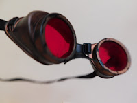
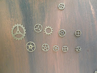
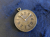
The next step was to photograph and isolate my Steampunk elements:

Goggles A variety of cogs A brass clock pendant


These will form the 'falling down' or 'rain like' element to my image.

From there it's just a question of pulling together the final piece.